
First, Install XlsxWrite Library
pip install xlsxwriterChart class of XlsxWriter allows us to create charts such as Area, Bar, Column, Bar, Line, Pie, Scatter and Radar.
Write data to excel using XlsWriter
import pandas as pd
import numpy as np
# Generate random uniform series
data = pd.DataFrame(
{'A': [np.random.uniform(0.1*i, 0.1*i + 1) for i in range(50)],
'B': [np.random.uniform(0.1*i, 0.1*i + 1) for i in range(50)]}
)
excel_file = 'exdata.xlsx'
sheet_name = 'Data'
#Pandas ExcelWriter with engine xlsxwriter
writer = pd.ExcelWriter(excel_file, engine='xlsxwriter')
data.to_excel(writer)
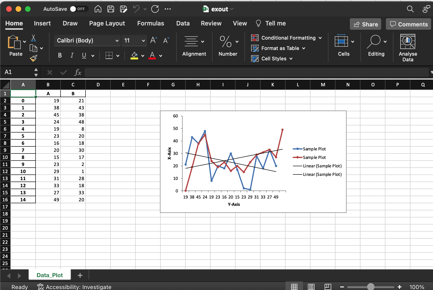
writer.save()Write data & create Line Graph
Two methods such as workbook.add_chart and worksheet.insert_chart are used to create the chart and insert the chart into work sheet respectively
import pandas as pd
import numpy as np

# random sample series
data = pd.DataFrame(
    {'A': np.random.randint(0, 50, 15),
     'B': np.random.randint(0, 50, 15)}
)


excel_file = 'exout.xlsx'
sheet_name = 'Data_Plot'

# ExcelWriter with engine xlsxwriter
writer = pd.ExcelWriter(excel_file, engine='xlsxwriter')
data.to_excel(writer, sheet_name=sheet_name)


workbook = writer.book
worksheet = writer.sheets[sheet_name]

# Create a line chart object.
chart = workbook.add_chart({'type': 'line'})

# Get the number of rows and column index
max_row = len(data)
col_x = data.columns.get_loc('A') + 1
col_y = data.columns.get_loc('B') + 1

chart.add_series({
    'name':       "Sample Plot",
    'categories': [sheet_name, 1, col_x, max_row, col_x],
    'values':     [sheet_name, 1, col_y, max_row, col_y],
    'marker':     {'type': 'circle', 'size': 4},
    'trendline': {'type': 'linear'},
})

#adding second series to create multiline chart
chart.add_series({
    'name':       "Sample Plot",
    'categories': "=Data_Plot!$A16:$A1",
    'values':     "=Data_Plot!$B16:$B1",
    'marker':     {'type': 'circle', 'size': 4},
    'trendline': {'type': 'linear'},
})


# Axis Name
chart.set_x_axis({'name': 'Y-Axis'})
chart.set_y_axis({'name': 'X-Asix',
                  'major_gridlines': {'visible': False}})

# Insert chart in the sheet
worksheet.insert_chart('G4', chart)

# Close and save the Excel file
writer.save()
Above code produces the following excel
Chat to the excel workbook using method, workbook.add_chart while created chart can be inserted into the sheet selected using method insert_chart.
Different types of charts supported by XlsxWriter are
| area | Filled Line style chart |
| bar | Bar style chart |
| column | Column style bar chart |
| line | Line style chart |
| pie | Pie chart |
| doughnut | Doughnut style chart |
| scatter | scatter plot |
| stock | stock style chart |
| radar | Radar chart |
.
Following example illustrates the creation of excel workbook with bar chart directly with xlswriter
import xlsxwriter
import numpy as np

workbook = xlsxwriter.Workbook('barcharts.xlsx')
worksheet = workbook.add_worksheet()


chart = workbook.add_chart({'type': 'column'})

data = [
  np.random.randint(0, 50, 5),
  np.random.randint(0, 50, 5),
  np.random.randint(0, 50, 5),
  np.random.randint(0, 50, 5)
]

worksheet.write_column('A1', data[0])
worksheet.write_column('B1', data[1])
worksheet.write_column('C1', data[2])
worksheet.write_column('D1', data[3])


chart.add_series({'values': '=Sheet1!$A$1:$A$5'})
chart.add_series({'values': '=Sheet1!$B$1:$B$5'})
chart.add_series({'values': '=Sheet1!$C$1:$C$5'})
chart.add_series({'values': '=Sheet1!$D$1:$D$5'})

#Insert Chart into Excel sheet
worksheet.insert_chart('A7', chart)

workbook.close()
Above code produced the excel with the output as follows
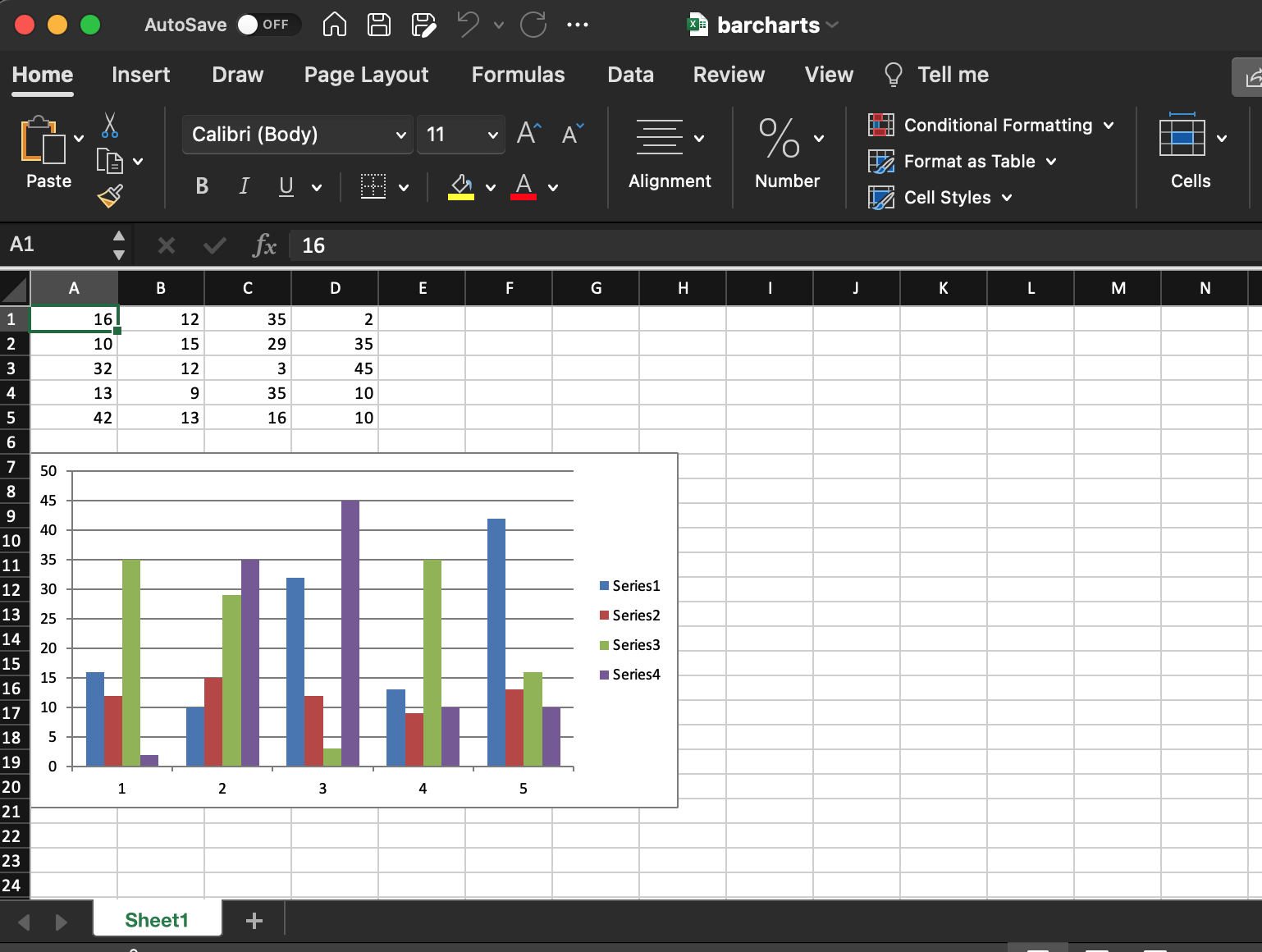
.
Different methods to write data into worksheet are
write()
write_string()
write_number()
write_blank()
write_formula()
write_datetime()
write_boolean()
write_url()
write_rich_string()
write_row()
write_column()
write_comment()
.


Leave a Reply